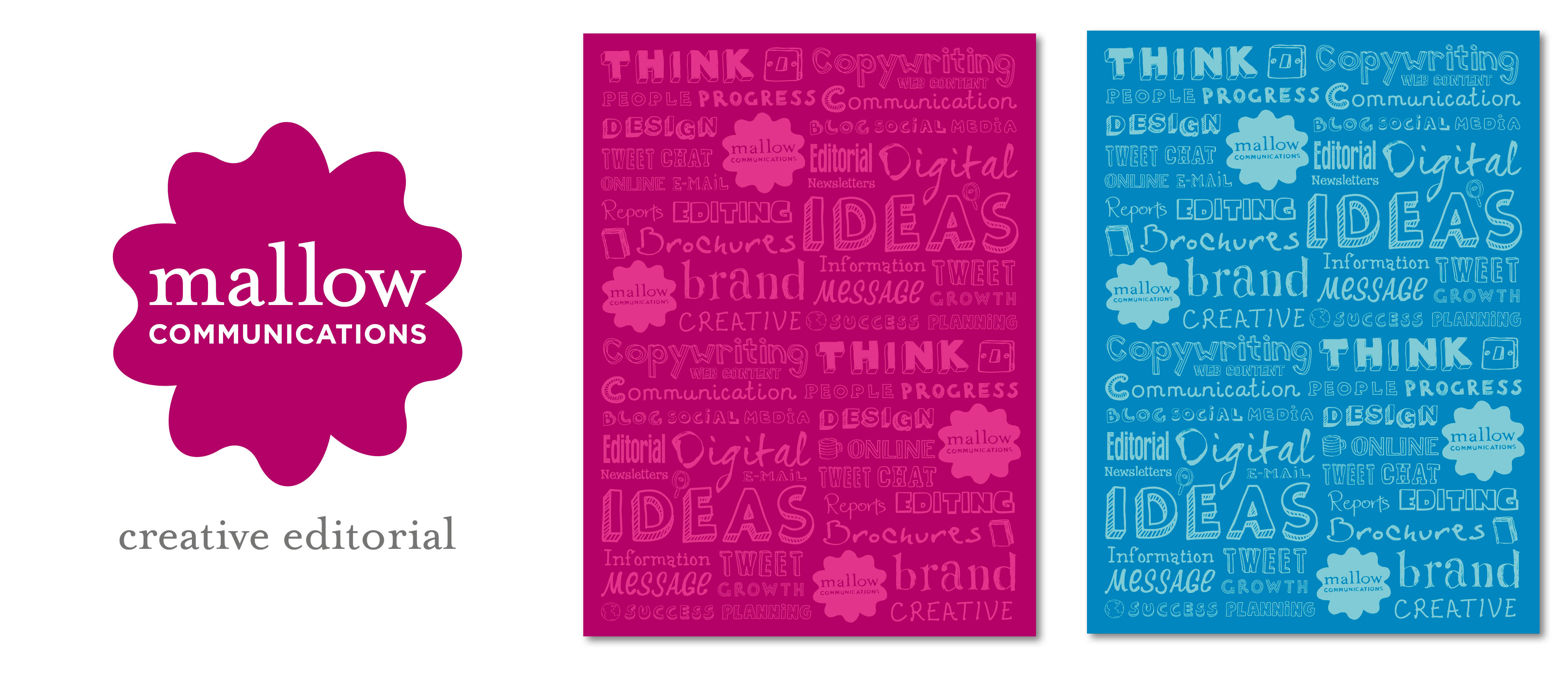
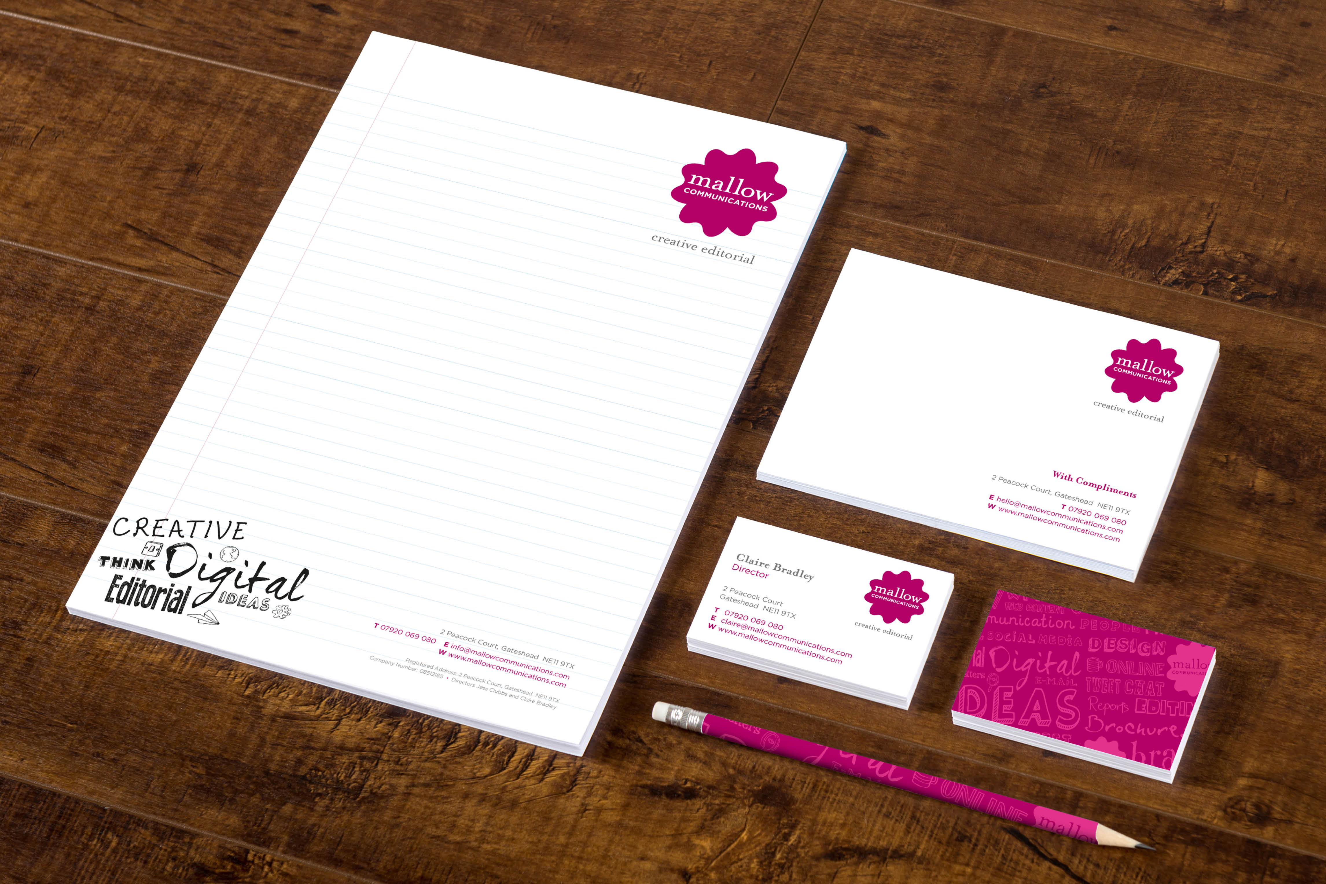
A small team of copywriters with a flair for the creative. Writing for clients, such as the NHS and Durham University, they have made strong inroads since starting in 2015. They wanted something simple but distinctive for their brand, that stood out in the copywriting world. The shape and colour comes from the flower, stylised and brightened up to give a distinctive feel. We added sketches and lined paper to the stationery and notepads, to give a sense of old-fashioned scribblings and the thoughts that begin all creative processes.


